Easily creating different sized grids by using Bootstrap
On my tip #92 I talked about what is Bootstrap and how to get started with it. Today we'll be covering one of the most used features on Bootstrap: the grid.
Bootstrap's grid is really cool and simple to use. You just have to write some HTML with the correct classes and it will automatically create a grid with whatever number of items you want. So let's see how we can use it!
<div class="row">

   <div class="col-md-4 item"> MD 4</div>
   <div class="col-md-4 item"> MD 4 </div>
   <div class="col-md-4 item"> MD 4 </div>

</div>


<div class="row">

   <div class="col-sm-3 item"> SM 3 </div>
   <div class="col-sm-3 item"> SM 3 </div>
   <div class="col-sm-3 item"> SM 3 </div>
   <div class="col-sm-3 item"> SM 3 </div>

</div>


<div class="row">

   <div class="col-lg-2 item"> LG 2 </div>
   <div class="col-lg-2 item"> LG 2 </div>
   <div class="col-lg-2 item"> LG 2 </div>
   <div class="col-lg-2 item"> LG 2 </div>
   <div class="col-lg-2 item"> LG 2 </div>
   <div class="col-lg-2 item"> LG 2 </div>

</div>
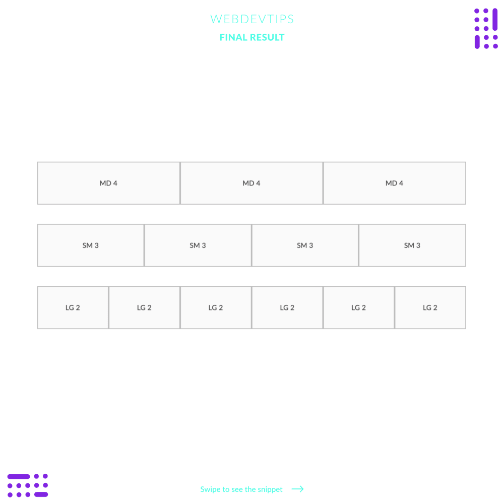
To create a grid system in bootstrap you first have to create a div with the class 'row' that will wrap all the items of each row. Then, each item can be a div with class 'col--size-number'.
number has to be a number between 1 and 12 since Bootstrap's grid uses a 12 column system. So on each row, the sum of all item's numbers must be 12. For example, if we want three columns on a row we just need to do 12/3, so each item must have the number 4. If we want 4 columns, each item must have the number 3.
size can be 'sm' for small, 'md' for medium, 'lg' for large and 'xl' for extra large. The bigger the size, the bigger will be the container max width before it breaks the columns to another row. This is awesome to deal with responsiveness because it allows you to control when the items should be start stacking one of top of the other.
.row{
   margin: 50px 0;
}

.item{
   padding: 40px;
   background: #FAFAFA;
   border: 2px solid #BDBDBD;
   text-align: center;
   color: #424242;
   font-size: 18px;
}
So now you can look at the example and understand how the grids shown are created. The first examples has three columns so we do '.row .col-md-4 .col-md-4 .col-md-4 .row'. The second example has four columns, so it's '.row .col-sm-3 col-sm-3 col-sm-3 col-sm-3 . row'. And so on..