Creating a parallax stars animation with just some CSS & JS
For today's we'll see how we can create a parallax animation with some stars moving at different speeds. We'll use CSS and some basic JS to achieve it 👌
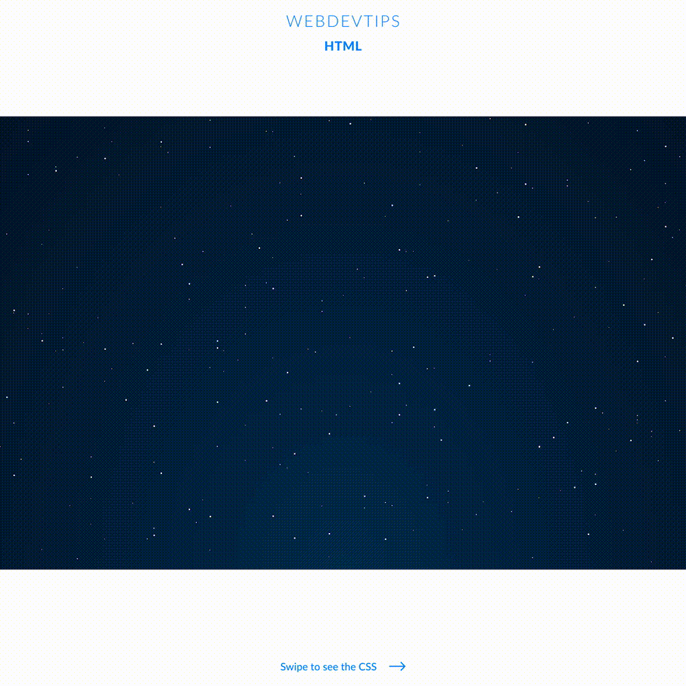
On our HTML we won't need anything. We'll create our stars with JavaScript and them insert them on the body of the page. So, we can jump straight to our script.
<body>

   <script>

       function createStars(type, quantity) {
           for (let i = 0; i<quantity; i++) {
               var star = document.createElement('div');
               star.classList.add('star', `type-${type}`);
               star.style.left = `${randomNumber(1, 99)}%`;
               star.style.bottom = `${randomNumber(1, 99)}%`;
               star.style.animationDuration = `${randomNumber(50, 200)}s`;
               document.body.appendChild(star);
           }
       }

       function randomNumber(min, max) {
           return Math.floor(Math.random() * max) + min;
       }

       createStars(1, 100);
       createStars(2, 85);
       createStars(3, 70);

   </script>

</body>
We create two functions. One is to generate a random number between a min and a Max number. We'll use this to apply random values to some CSS properties. Then we have our main function called 'createStars'. This function accepts two parameters - type and quantity. We'll have three types of stars so that's what the type is for. Quantity is obviously for the number of stars we want.
This function will basically create a loop based on the quantity we chose. On each iteration it will create a div with two classes - 'star' and 'type' based on the type we pass the function. We then give this div some random values for the 'left', 'bottom' and 'animation-duration' properties. This way all stars will be placed in different places and will move with different velocities. Finally we append this div to the document's body. Then, we just need to call this function with the 3 types and the quantity we want.
body{
   min-height: 100vh;
   background: radial-gradient(ellipse at bottom, #013155 0%, #01162E 100%);
}

.star{
   position: absolute;
   background: white;
   border-radius: 50px;
   animation: move;
   animation-iteration-count: infinite;
   animation-timing-function: linear;
}

.type-1{
   width: 1px;
   height: 1px;
}
.type-2{
   width: 2px;
   height: 2px;
}
.type-3{
   width: 3px;
   height: 3px;
}

@keyframes move {
   0%{ transform: translateY(0); }
   100%{ transform: translateY(-1000px); }
}
The CSS for this is pretty straightforward. First, we give a background to our body that resembles a night sky. We then set some properties for 'star' , set different sizes for each 'type' and finally we declare the keyframes for our animation that will make the stars go up.