Creating a scroll snap effect with CSS
What's up guys? Ready to start the week with a cool CSS tip? Today we'll be looking how to easily create a scroll snap effect from scratch! This is an awesome and handy effect that makes when the window snap and lock to specific points when the user is scrolling.
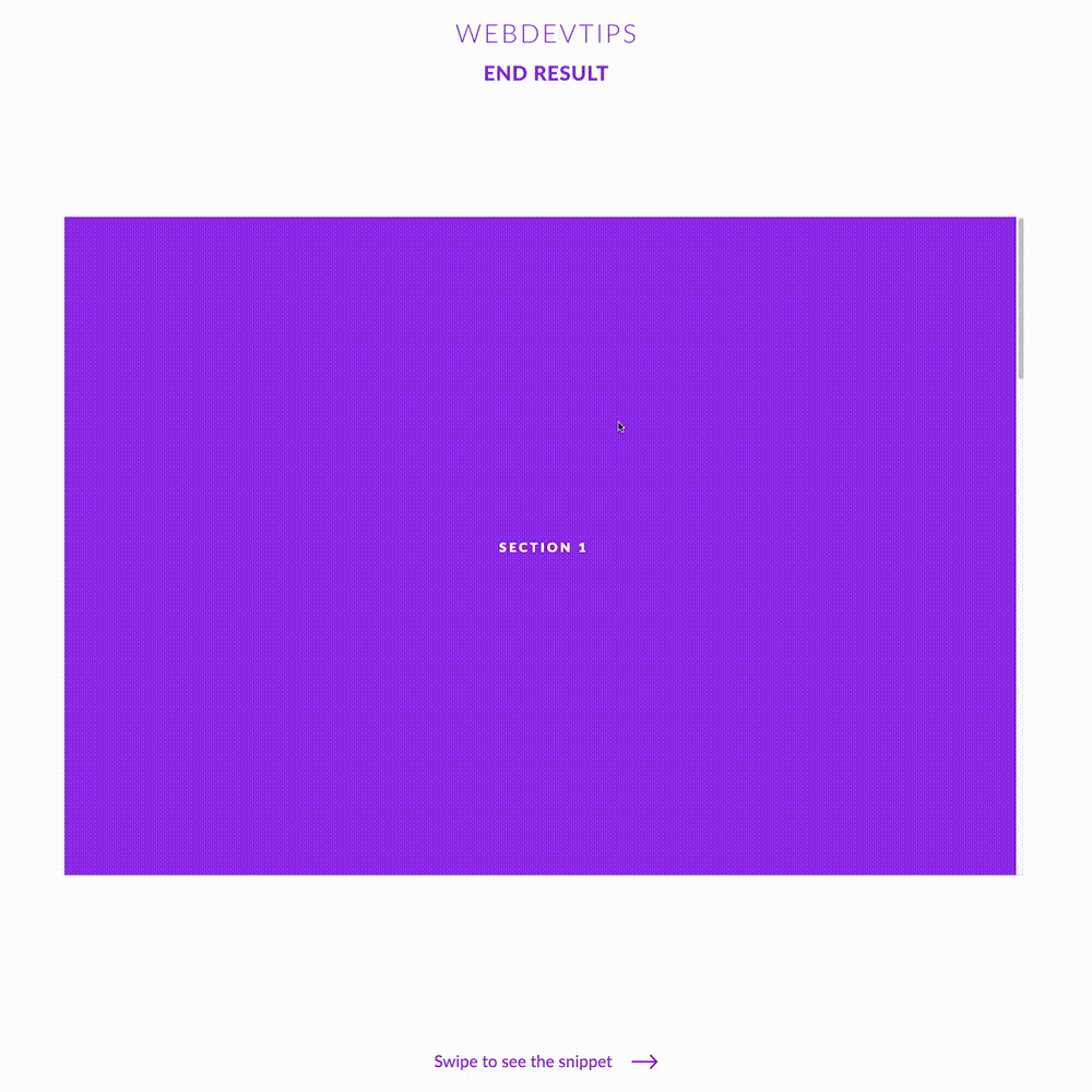
To better understand what this effect is all about, watch the video on the second slide. When I scroll with the mouse wheel or using the scrollbar, the window automatically slides to the middle of the page thus showing the whole section. Let's see how to do this!
<div class="scroll-container" style="height: 100vh;">

   <section style="background: #9930EC;"><h1>Section 1</h1></section>
   <section  style="background: #00D3DA;"><h1>Section 2</h1></section>
   <section  style="background: #6502EA;"><h1>Section 3</h1></section>
   <section  style="background: #36F4E4;"><h1>Section 4</h1></section>

</div>
We start by creating four 'section' that will be wrapped by a 'scroll-container' div. On this div we'll have to apply 'overflow-y: scroll' to make this whole div scrollable and 'scroll-snap-type: y mandatory'. This last property is what makes the scroll snap possible on this element, on the y axis.
Then, we give some basic styling to all of our 'sections' so they have full width and the full height of the screen and we need 'scroll-snap-align: start' so the scroll locks exactly on each of these sections.
.scroll-container {
   scroll-snap-type: y mandatory;
   overflow-y: scroll;
   overflow-x: hidden;
}

section {
   scroll-snap-align: start;
   height:100vh;
   width: 100vw;
   display: flex;
   align-items: center;
   justify-content: center;
}

h1 {
   color: white;
   text-transform: uppercase;
   font-weight: 600;
   font-size: 19px;
   letter-spacing: .2em;
   font-weight: 800;
}
And that's basically it! Apart from the styling of the elements, we just need those two CSS properties to create this scroll snap effect.