How to create a side navigation menu with a slide effect
For this tip, i decided to show how to create a simple side menu that will slide from the right. This type of menus have been pretty common for a while and are always a cool asset to add to your projects. They are also super simple to create!
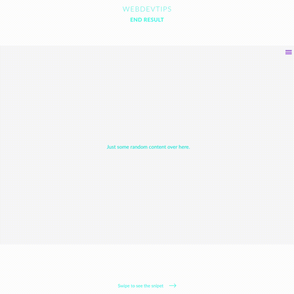
In the HTML, you just need to have a button where we'll click to open the menu - in this case we're using the typical hamburger icon - and a div that's gonna act as our menu. In the hamburger menu, we'll have an 'onClick' function that will open the menu - this function will just add the class 'is-open' to our 'menu' div element and create an eventListener on the 'body' element to remove this same class from the 'menu' div.
<div class="parent flex-center">

   <div class="hamburguer-icon" onclick="openMenu()">
       <span></span>
       <span></span>
       <span></span>
   </div>

   <div class="content">
       <p>Just some random content over here.</p>
   </div>

</div>

<div id="menu" class="sliding-menu">
   <!-- Your Menu content here -->
</div>


<script>

   function openMenu(){
       document.getElementById('menu').classList.add('is-open')
       document.querySelector('.parent').addEventListener('click', closeMenu, true)
   }

   function closeMenu(){
       document.getElementById('menu').classList.remove('is-open')
       document.querySelector('.parent').removeEventListener('click', closeMenu, true)
   }

</script>
In our CSS, we begin by 'creating' and styling our hamburger menu and then we style our actual menu. In order to do this, we just set this menu with a fullscreen height, a width of 400px, a fixed position with some coordinates to stick it to the right side of the screen and then we'll use 'transform: translateX(450px)' to hide our menu to the right.
When the menu has the class 'is-open' we'll set 'transform: translateX(0)' to bring our menu back from the right with a smooth slide effect.
.content{
   color: #31EDDE;
   font-size: 1.5em;
}

.flex-center{
   display:flex;
   align-items: center;
   justify-content: center;
}

.hamburguer-icon{
   position: absolute;
   right:25px;
   top:25px;
   cursor: pointer;
}

.hamburguer-icon span{
   display: block;
   background-color: #8225E2;
   height: 3px;
   width: 30px;
   margin-bottom: 5px;
}

#menu{
   height: 100vh;
   width: 400px;
   background: linear-gradient(-30deg, #4A00E0, #8E2DE2);
   position: fixed;
   top: 0;
   right: 0;
   transition: all .4s ease;
   transform: translateX(450px);
}

#menu.is-open{
   transform: translateX(0);
}
Super easy, right??