Creating a ribbon only by using CSS
Hey guys! 😁
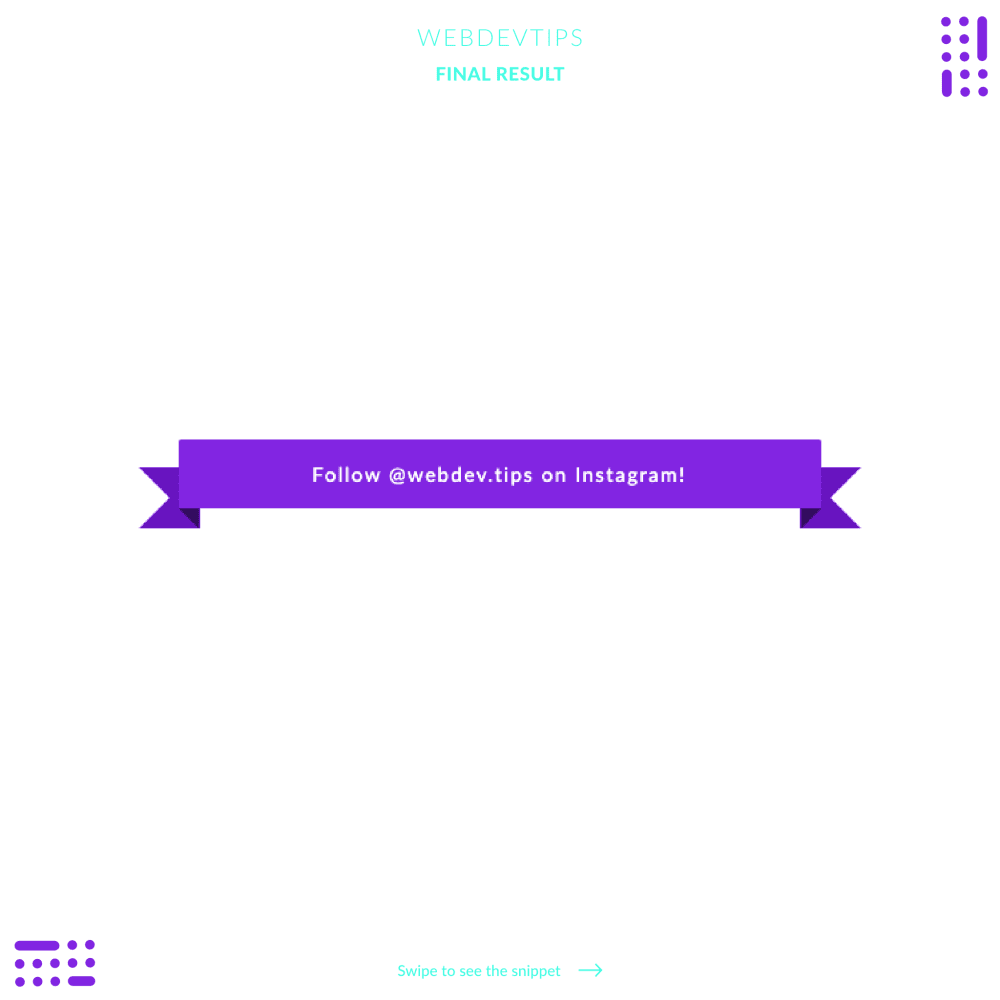
Today I'll show you how to create a classic ribbon with some CSS. Ribbons are a fancy element that are commonly used in things like pop-ups, headers, etc. I'll show you how to do a pretty basic one but you can then easily customize it for it to look whatever you want to.
In terms of HTML we only need a div with the class 'ribbon' and inside it we'll have a span wrapping all of our text.
   <div class="ribbon">

       <span>Follow @webdev.tips on Instagram!</span>

   </div>
Then we need some CSS to get things going. I won't go into much detail on this styles, because all of the rules are pretty straightforward. Basically what we're doing here is using the pseudo-elements 'before' and 'after' on our div and on our span to be able to create the ribbon flaps.
.ribbon {
   position: relative;
   width: 70%;
   color: #fff;
   background: #8225E2;
   text-align: center;
   padding: 15px 20px;
   font-size: 15px;
   border-radius: 2px;
   letter-spacing: .1em;
}

.ribbon:before, .ribbon:after {
   content: "";
   position: absolute;
   bottom: -15px;
   border: 23px solid #6814bf;
   z-index: -1;
}

.ribbon:before {
   left: -30px;
   border-right-width: 23px;
   border-left-color: transparent;
}

.ribbon:after {
   right: -30px;
   border-left-width: 23px;
   border-right-color: transparent;
}

.ribbon span:before, .ribbon span:after {
   content: "";
   position: absolute;
   border-style: solid;
   border-color: #340b5f transparent transparent transparent;
   bottom: -15px;
}

.ribbon span:before {
   left: 0;
   border-width: 15px 0 0 15px;
}

.ribbon span:after {
   right: 0;
   border-width: 15px 15px 0 0;
}
Then, on these pseudo-elements we mess around with their borders, and apply them a transparent color on some of the sides so we can create all those edges and even those shadows that we see on the ribbon .
Hope you liked this tip and let me know your doubts! 😎🤘