What's the difference between using EM's and REM's units?

Hey guys!
On today's tip we'll be seeing what is the main difference between using EM's and REM's when dealing with size units in CSS.
EM's and REM's are nowadays two of the most used units due to being super helpful when doing responsive webdesign. Even though they are similar they have a major difference and that's what we will be analyzing.
Both units are calculated in relation to the font-size of another element, and this is where we have the major difference: EM's will be calculated in relation to the font-size of it's parent element while REM's will be calculated in relation to the font-size of the root element (html).
This basically means the following: if we have an 'h1' with 'font-size: 2em' and it's parent has 'font-size: 20px' then the 'h1' will have 40px ( 2 x 20 ). And if we have an 'h1' with 'font-size: 2rem' and our 'html' element has 'font-size: 16px' then the 'h1' will have 32px (16 x 2).
    <div class="container">

       <div class="box em-unit">
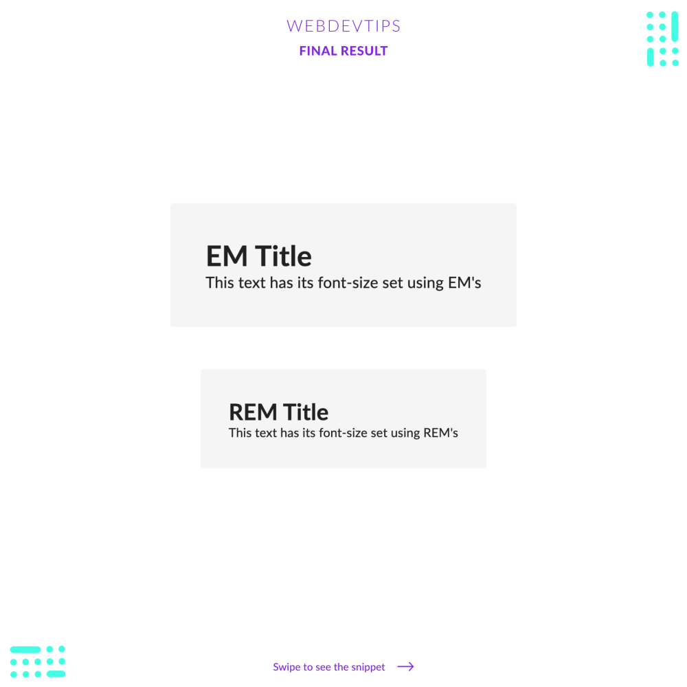
           <h2>EM Title</h2>
           <p>This text has its font-size set using EM's</p>
       </div>

       <div class="box rem-unit">
           <h2>REM Title</h2>
           <p>This text has its font-size set using REM's</p>
       </div>

   </div>
Look with attention at the example provided to see this in action and to understand all the calculations that are being made. And remember that 'em' will always be in relation to it's closer parent element that has a defined 'font-size' while 'rem' will always be in relation to the 'font-size' defined on our 'html' element.
Finally, both are super handy and can serve different purposes. For example, if you have a card element that has some padding and then it has a title, a text and a smaller text inside, and on smaller screens you want to resize everything and make everything smaller, it's better to use EM's. You just need to apply EM units on the title, the texts and the padding and then when you reduce the font-size on the parent element, everything will scale down accordingly.
html {
   font-size: 16px;
}

.box {
   font-size: 20px;
   background-color: #F5F5F5;
   border-radius: 4px;
   color: #212121;
   margin: 30px 0;
}


.em-unit { padding: 2.5em; } /* 2.5em = 20px * 2.5 = 50px */

.em-unit h2 { font-size: 2em; } /* 2em = 20px * 2 = 40px */

.em-unit p { font-size: 1.1em; } /* 1.1em = 20px * 1.1 = 22px */


.rem-unit { padding: 2.5rem; } /* 2.5rem = 16px * 2.5 = 40px */

.rem-unit h2 { font-size: 2rem; } /* 2rem = 16px * 2 = 32px */

.rem-unit p { font-size: 1.1rem; } /* 1.1rem = 16px * 1.1 = 17.6px */
For all the other cases I personally prefer using REM because if you need to scale down the whole text of your page you just need to change the font-size on your HTML!
Hope you liked this tip and have a great Friday! 😁🔥🤘