Creating a cool hover effect with some CSS
How was your weekend guys?
Ready to start the week with a little CSS tip?
We'll see today how some pretty slick buttons with a cool hover effect on then!
I don't know about you, but i love seeing different types of buttons with different types of hover effects on them. If well made, it really helps give that little spark to your website. A while ago i saw a button like this one somewhere and i decided to create a tip on how to create something like. So, let's go!
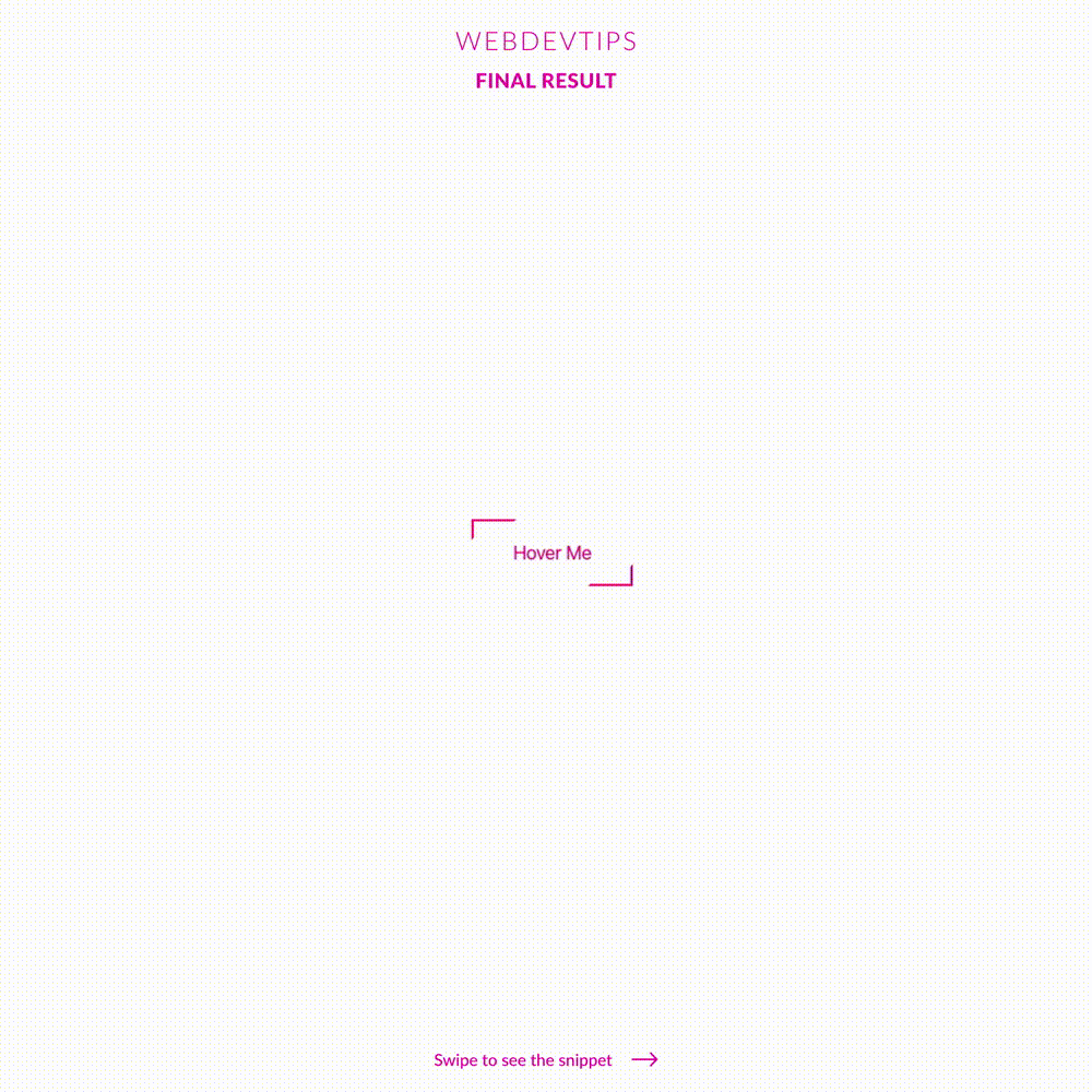
<button>Hover Me</button>
We'll start obviously with our HTML where we just need a 'button' element with some text inside it. Let's check out the CSS.
button {
   position: relative;
   padding: 20px 35px;
   font-size: 16px;
   color: #F91890;
   border: none;
   cursor: pointer;
}

button::after, button::before {
   content: '';
   position: absolute;
   width: 25%;
   height: 25%;
   border: 2px solid #F91890;
   transition: all .8s ease;
}

button::after {
   bottom: 0;
   right: 0;
   border-top-color: transparent;
   border-left-color: transparent;
}

button::before {
   top: 0;
   left: 0;
   border-bottom-color: transparent;
   border-right-color: transparent;
}

button:hover::after, button:hover::before {
   width: 100%;
   height: 100%;
}
Basically, this effect works by us creating a 'before' and an 'after' on our button, placing each one on opposite corners (top left and bottom right) and then play around with their border colors.
And that's pretty much what we see on the hover effect. We just some small borders on the corners, and when we hover the button, those borders will increase their size and make the whole size of button. Pretty cool, right?
Let me known what do you think of it guys, have a nice one! 😁🤘✌️