Creating a collapsable sidebar with icons from scratch
Happy Monday guys 😁🔥
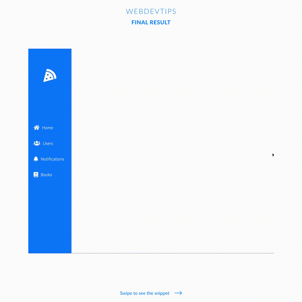
We'll start this week with a tip on how to create a sidebar with some icons and text and then we'll toggle it to collapse, hiding the text and keeping the icons. In order to do this we'll use some CSS and a couple of lines of JavaScript.
First, we have to lay down our structure for the sidebar on the HTML. We just need to have a div for the sidebar with the ID and class 'nav', and inside it we'll place a logo and some items. On our logo we create an 'onclick' attribute that will run a function called 'collapseNav'.
<div class="page">

    <div id="nav" class="nav">
        <div class="logo" onclick="collapseNav()"><i class="fas fa-pizza-slice"></i></div>

        <div class="item"><i class="fas fa-home"></i><span>Home</span></div>
        <div class="item"><i class="fas fa-users"></i><span>Users</span></div>
        <div class="item"><i class="fas fa-bell"></i><span>Notifications</span></div>
        <div class="item"><i class="fas fa-book"></i> <span>Books</span></div>
    </div>

</div>

<script>
    const collapseNav = () => {
        document.getElementById("nav").classList.toggle("collapsed");
    }
</script>
Now we need to create a script with this function. This function will only grab our 'nav' div and on it we'll toggle the class 'collapsed'. So when we click on the logo once we add the class 'collapsed' to our nav and if we click again we'll remove that class!
.page {
   position: relative;
   width: 100vw;
   min-height: 100vh;
}

.nav {
   position: absolute;
   left: 0;
   top: 0;
   width: 165px;
   height: 100%;
   background-color: #007EFF;
   display: flex;
   flex-direction: column;
   justify-content: center;
   box-sizing: border-box;
   color: white;
   transition: all .3s ease;
}

.logo {
   font-size: 50px;
   position: absolute;
   top: 75px;
   left: 50%;
   transform: translateX(-50%);
   cursor: pointer;
   transition: all .3s linear;
}

.item {
   margin: 20px 0 20px 20px;
   display: flex;
   overflow: hidden;
}


.item i {
   font-size: 20px;
}

.item span {
   font-weight: 300;
   margin-left: 10px;
}

.nav.collapsed {
   width: 60px;
}

.nav.collapsed .item{
   margin: 20px auto;
}

.nav.collapsed .item span{
   display: none;
}

.nav.collapsed .logo{
   transform: translateX(-50%) scale(.7);
}
Finally, we just need some CSS to put all this together. We use some basic styles to get things to look how you see on the example. Then, when the class 'collapsed' is on our nav, we'll decrease the width of our nav, we'll hide the text from each menu item and we'll resize our logo to fit the sidebar.
And that is all, hope you have liked this tip! 😅🔥👌