Creating different layouts using Grid Areas in CSS
Hello guys, how was your weekend? 😁
Today's tip is about CSS grid, more specifically grid areas. Grid Areas allow us to create multiple different layouts in a super intuitive and visual way. Let's see!
<div class="grid-container">

   <div class="item header">Header</div>
   <div class="item main">Main</div>
   <div class="item aside">Aside</div>
   <div class="item footer">Footer</div>

</div>
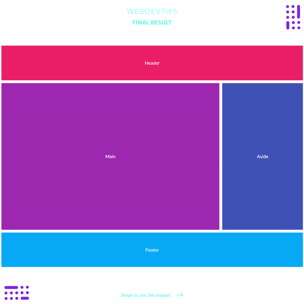
Look at the example. We have a simple (and common) layout with a header, a main section, an aside and a footer. We can create this whole layout using CSS Grid. We start by creating a container for everything and give it a class of 'grid-container'. Inside we'll create a div for any of these sections of our layout. On these divs we'll give it a common class 'item' and then a specific class for each one.
.grid-container{
    display:grid;
    grid-template-areas:
        "header header header header"
        "main main main aside"
        "footer footer footer footer"
    ;
    grid-template-rows: 1fr 4fr 1fr;
    min-height: 100vh;
}

.item {
    display: flex;
    align-items: center;
    justify-content: center;
    color: #fff;
    border: 5px solid #FAFAFA;
}

.header {
    grid-area: header;
    background-color: #E91E63;
}
.main {
    grid-area: main;
    background-color: #9C27B0;
}
.aside {
    grid-area: aside;
    background-color: #3F51B5;
}
.footer {
    grid-area: footer;
    background-color: #03A9F4;
}
Now on our CSS, we need to do two important things: on every section we give it a 'grid-area' name so we can then target each. Here you can choose whatever name you want, but it's always better to identify correctly what that area is. Then, on our 'grid-container' we start by setting 'display: grid' and we set our 'grid-template-areas' to create the layout we want.
For this property we use a string and this string will visually represent our layout. If you look at the string in this example and at the example image you can easily understand this. Finally, we need to set the 'grid-template-rows' so that our header and footer both have 1fraction of the available space in terms of height and our main and aside sections have 4 fractions of the available space in height.
Hope you liked this tip and let me know your doubts! 🤓👌