Reveal text on hover effect with a gradient overlay
Happy Friday 😎🔥
For today I thought of sharing with you a simple snippet that I've used recently on a project and that I find quite useful: a revealing text on hover effect with a gradient as a background for legibility.
This is useful when you want to show some text on top of an image, and need some sort of overlay to make sure there's enough contrast to see the text, but don't want the overlay covering the whole image.
<div class="image">
<div class="image__title">
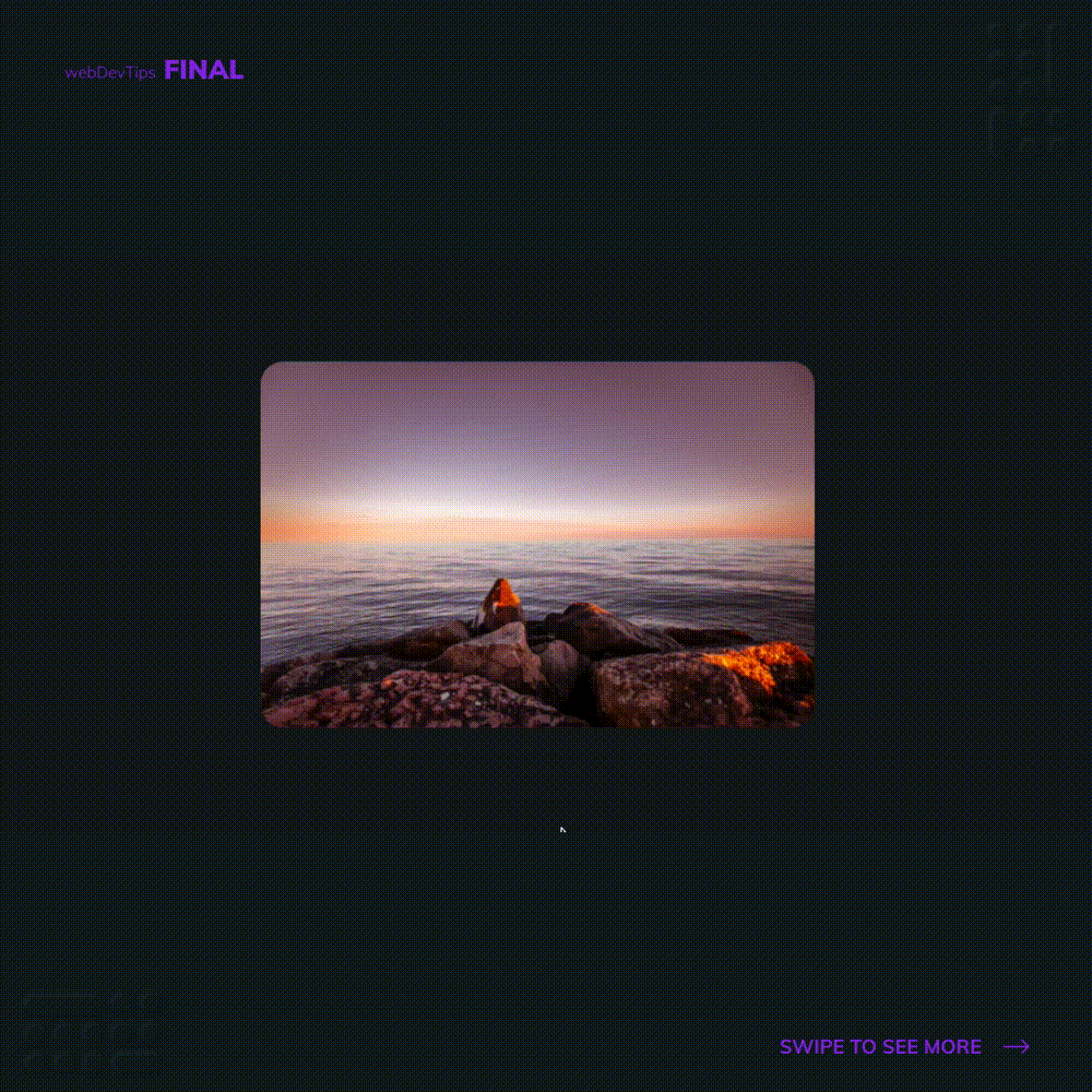
<h3>Sunset on the beach</h3>
</div>
</div>
We just need a div where we'll set the image as background, and another div inside that will wrap our text.
We have to make sure that our 'image' div has 'position: relative' and 'overflow: hidden'. Then, our 'image__title' div will have 'position: absolute' and will be positioned on the bottom of the 'image' div. As background we'll use a gradient that will go from black to transparent.
.image {
  position: relative;
  width: 30rem;
  height: 20rem;
  background-image: url('./1.jpg');
  background-size: cover;
  background-clip: content-box;
  border-radius: 20px;
  background-position: center center;
  overflow: hidden;
}

.image__title {
  position: absolute;
  left: 0px;
  right: 0px;
  bottom: 0px;
  min-height: 9rem;
  display: flex;
  align-items: flex-end;
  opacity: 0;
  background: -webkit-gradient(
    linear,
    0% 0%,
    0% 100%,
    color-stop(-0.3, transparent),
    to(rgb(20, 20, 20))
  );
  padding: 0px 1.5rem 1.5rem;
  transition: all 0.4s ease 0s;
}

.image:hover .image__title {
  opacity: 1;
}
Then we just need to set 'opacity: 0' on the 'image__title' and we'll change it to 1 when we hover the 'image' div.
And we're done! Let me know if you liked it 😁✌