Creating a simple parallax effect with CSS only
The well known parallax effect - where basically different elements move at different speeds when you scroll the page thus creating a cool depth effect - has been here for a while now. It was a huge trend like 4/5 years ago that is now slowly dying. Still, it's pretty common to see subtle and really small parallax scroll effects on some websites.
<body>
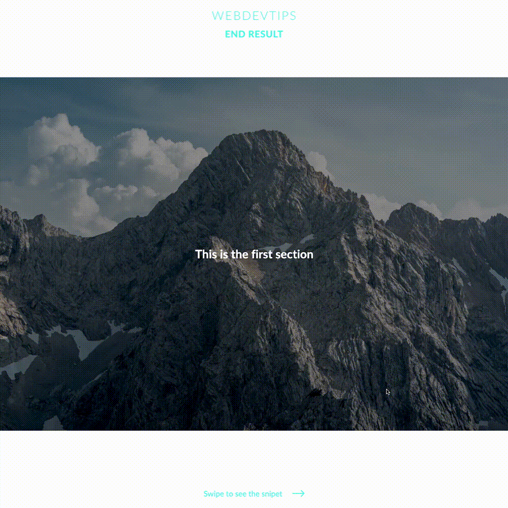
<div class="first-section section">
<h1>This is the first section</h1>
</div>
<div class="second-section section">
<h1>This is the second section</h1>
</div>
<div class="third-section section">
<h1>This is the third section</h1>
</div>
</body>
There are different ways of creating a parallax effect, some are more complex but get better results and others are simpler. Here i'll show you the simplest way possible to create a parallax effect that basically just uses one line of CSS!
.section{
   position:relative;
   display:flex;
   align-items: center;
   justify-content: center;
   color:#fff;
   width: 100%;
   height:100vh;
   background-size: cover;
   background-position: center center;
   background-attachment: fixed;
   z-index:-1;
}

.section::before{
   content: '';
   position: absolute;
   top:0;
   left:0;
   width:100%;
   height:100%;
   background-color: rgba(0,0,0,.4);
   z-index:-1;
}

.first-section{
   background-image:url('./1.jpg');
}

.second-section{
   background-image:url('./2.jpg');
}

.third-section{
   background-image:url('./3.jpg');
}
Simply create an element - i used div's - that cover all of your screen ('width:100%' & 'height:100vh') and give it some background-image. Then, you only need to use 'background-attachment: fixed'. This is where the magic happens. It will make the background stay fixed on your element while to content on top of it will scroll in a normal way. This is what creates that parallax effect.
Super simple, right? 🤓