Creating a nice tooltip effect when hovering some text
The tooltip effect is pretty handy when you need to present some extra info to the user. One of it's mainly uses is, for example, when a user is about to perform some action and you want to use the tooltip to tell him what that action will do.
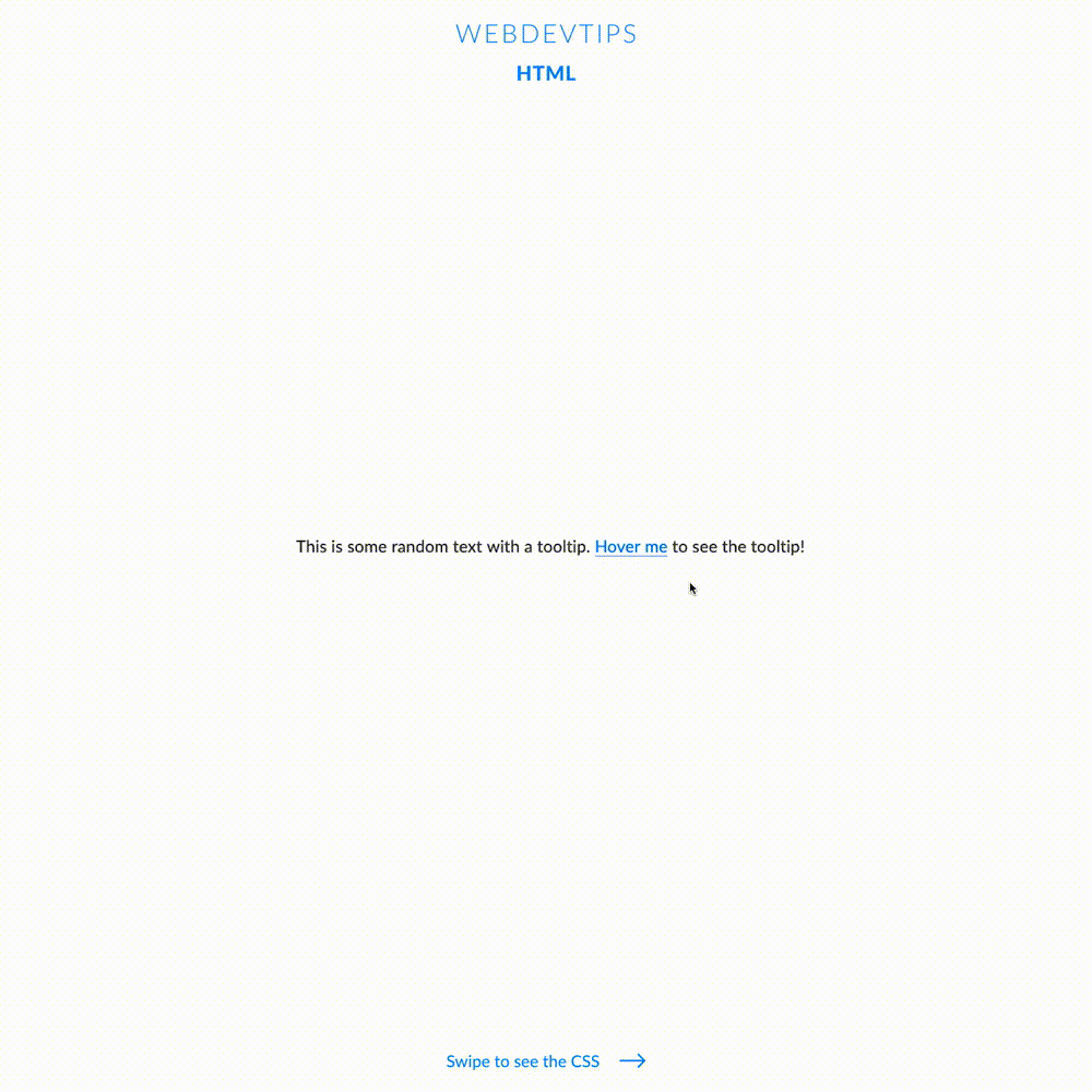
<div class="text">

   <p>This is some random text with a tooltip. <a href="#" data-tooltip="I'm a f*cking tooltip!">Hover me</a> to see the tooltip!</p>

</div>
To do this tooltip effect we'll use an anchor element with the content we want on the tooltip. We'll then use CSS to target this anchor, give it an ::before and an ::after pseudo element and style it to look like how we see in the video.
We'll then give 'opacity: 0' to both pseudo elements to hide the tooltip and change this opacity to 1 when the element is being hovered.
.text{
   color:#424242;
   font-size: 1.3em;
}

a, a:hover, a:visited{
   color:#007EFF;
}

a[data-tooltip]:link, a[data-tooltip]:visited {
   position: relative;
   text-decoration: none;
   border-bottom: solid 1px;
}

a[data-tooltip]:before {
   content: "";
   position: absolute;
   border-top: 20px solid #007EFF;
   border-left: 30px solid transparent;
   border-right: 30px solid transparent;
   top: -18px;
   left: -26px;
   opacity:0;
   transition: all .05s linear;
}

a[data-tooltip]:after {
   content: attr(data-tooltip);
   position: absolute;
   color: white;
   top: -39px;
   left: -26px;
   background: #007EFF;
   padding: 5px 15px;
   -webkit-border-radius: 10px;
   -moz-border-radius: 10px;
   border-radius: 10px;
   white-space: nowrap;
   opacity:0;
   transition: all .1s linear;
}

a[data-tooltip]:hover:before, a[data-tooltip]:hover:after {
   opacity:1;
}


a:after{
   font-size: .9em;
}
It's a pretty cool and simple effect that can enhance the look and feel of your application!