Using CSS to create tinted backgrounds
So today we have a pretty basic CSS tip on how we can create tinted backgrounds. This is fairly easy to do, so let's check it out.
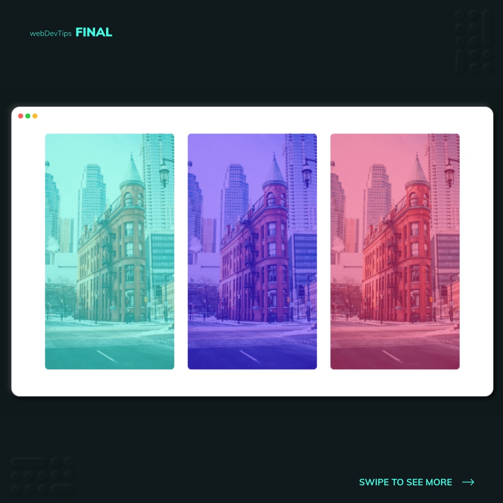
Check the example. We just have three divs, each one with two classes. To these divs I'm passing a class with the color I want on the background.
<div class="image green"></div>

<div class="image blue"></div>

<div class="image pink"></div>
Then, on the CSS, using these color classes I just apply a background where I'm setting a linear gradient and an image. This linear gradient is what will create the tinted effect, so we just need to create a gradient with whatever color we want.
.green {
  background: linear-gradient(rgba(69, 252, 228, 0.5), rgba(69, 252, 228, 0.5)),
    url('./1.jpg');
}
.blue {
  background: linear-gradient(rgba(70, 5, 255, 0.5), rgba(70, 5, 255, 0.5)),
    url('./1.jpg');
}
.pink {
  background: linear-gradient(rgba(233, 30, 99, 0.5), rgba(233, 30, 99, 0.5)),
    url('./1.jpg');
}

.image {
  width: 20rem;
  height: 35rem;
  margin: 0 1rem;
  border-radius: 8px;
  background-size: cover;
}
And we're done. Basically with a single CSS property we can create this tinted effect on a background!
Let me know your thoughts guys, take care 😁✌️