Creating fluid layouts in CSS using the clamp function
Using clamp () in CSS 🔥
Hey guys! Today we'll check a really neat CSS function that we can use to help us creating fluid layouts: clamp(). The clamp function works by clamping a value between two defined values and we can use pretty much on all properties that accept a number value. We pass it three parameters: the min value, the preferred value and the max value.
So let's say we have a div and to set it's width we use 'clamp(50px, 50%, 300px)'. Depending on the viewport size, this div will always have a minimum width of 50px, a maximum width of 300px and, whenever possible, it will have a width of 50% of it's parent.
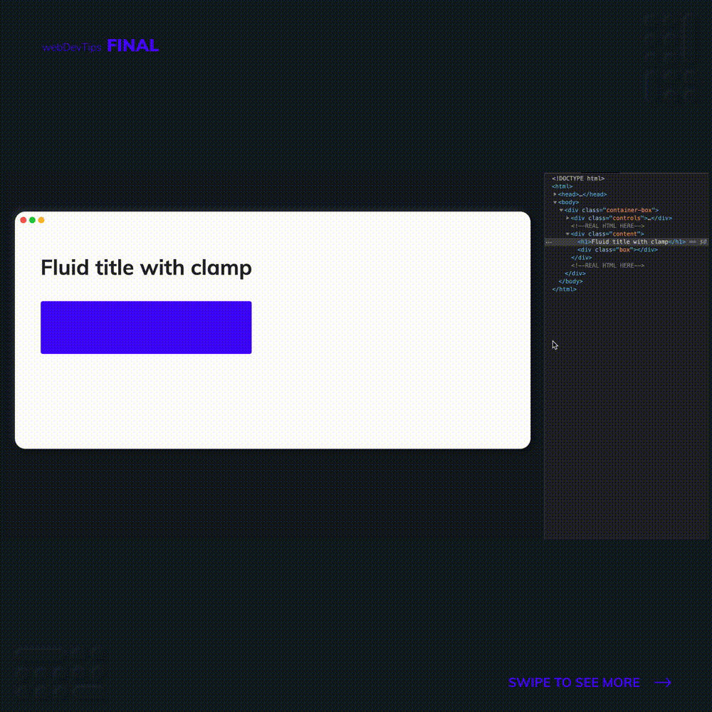
<h1>Fluid title with clamp</h1>

<div class="box"></div>
Check the example to see how this works. I'm using clamp to set the font-size on the text and then I'm using clamp to set the width on the div. When we resize the page, the font-size and the width are changing, but will always respect the values I passed to the clamp function. Whenever possible it will use the preferred value, it will never pass the maximum value and it will never go below the minimum value, even when the viewport is super small!
h1 {
  font-size: clamp(2rem, 4vw, 4rem);
  color: #262626;
}

.box {
  width: clamp(150px, 50%, 400px);
  height: 10rem;
  border-radius: 4px;
  background-color: #4605ff;
  margin-top: 4rem;
}
Overall, this is a really useful feature that we can now start using since it has an acceptable browser support!
Give it a try guys! 🤓👌