Dark theme toggle in React with styled-components
Dark theme toggle in React with styled components 🔥
What's up guys? Today we'll check how to create a Dark Mode toggle using styled components in React!
So the first thing we need to do is create a 'theme.js' file where we'll create two themes: a light theme and a dark theme. Note that for this to work well we should have exactly the same properties on both themes.
// styles/theme.js

export const lightTheme = {
  background: '#ffffff',
  titles: '#333333',
  text: '#444444',
  accent: '#45FCE4',
}

export const darkTheme = {
  background: '#171717',
  titles: '#ffffff',
  text: '#dedede',
  accent: '#45FCE4',
}
Now we can go ahead and create a file 'globalStyles.js' where we'll have the main styles for our app. In here we'll already use the properties we created on our themes.
// styles/globalStyles.js

import { createGlobalStyle } from 'styled-components'

export const GlobalStyles = createGlobalStyle`
    * {
        box-sizing: border-box;
        margin: 0;
    }

    body {
        background: ${props => props.theme.background};
        color: ${props => props.theme.text};
    }

    h1 {
        color: ${props => props.theme.titles};
    }

    .accent {
        color: ${props => props.theme.accent};
    }
`
Finally, we'll go to our root component - App.js - and we'll start by importing our 'globalStyles', the two themes we created and 'ThemeProvider' from styled-components. Then, using the 'useState' hook, we'll use the 'isDarkTheme' var to toggle between the light theme and dark theme.
// App.jsx
import React, { useState } from 'react'
import { ThemeProvider } from 'styled-components'
import { lightTheme, darkTheme } from './styles/theme'
import { GlobalStyles } from './styles/globalStyles'
const StyledApp = () => {
const [isDarkTheme, setIsDarkTheme] = useState(false)
return (
<ThemeProvider theme={isDarkTheme ? darkTheme : lightTheme}>
<>
<GlobalStyles />
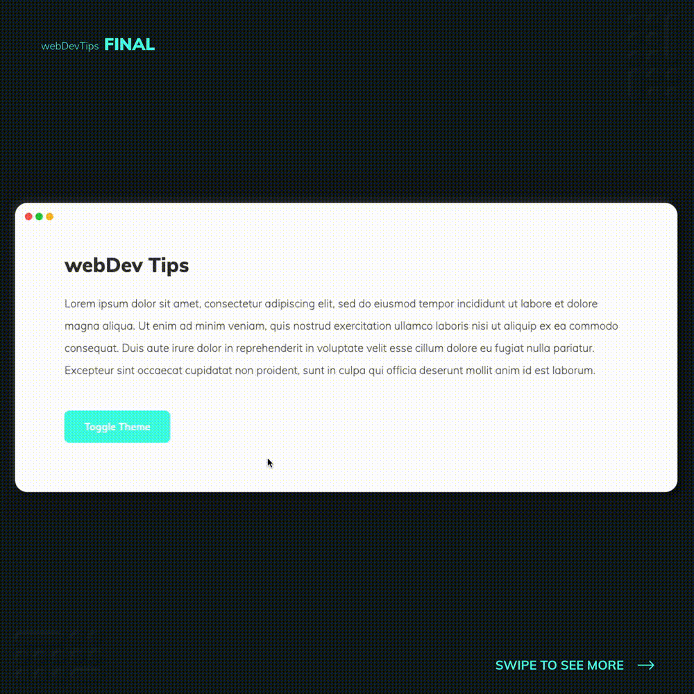
<h1>webDev Tips</h1>
<p>
Lorem ipsum dolor sit amet, consectetur adipiscing elit, sed do
eiusmod tempor incididunt ut labore et dolore magna aliqua. Ut enim ad
minim veniam, quis nostrud exercitation ullamco laboris nisi ut
aliquip ex ea commodo consequat. Duis aute irure dolor in
reprehenderit in voluptate velit esse cillum dolore eu fugiat nulla
pariatur. Excepteur sint occaecat cupidatat non proident, sunt in
culpa qui officia deserunt mollit anim id est laborum.
</p>
<button className="accent" onClick={() => setIsDarkTheme(!isDarkTheme)}>
Toggle Theme
</button>
</>
</ThemeProvider>
)
}
export default StyledApp
To wrap this up, we just need to wrap the content our of App in a 'ThemeProvider' and pass it the current theme we want to use.
And that's it guys! Let me know your thoughts 😁🙏