How to create knockout text with CSS
Creating knockout text with CSS 🔥
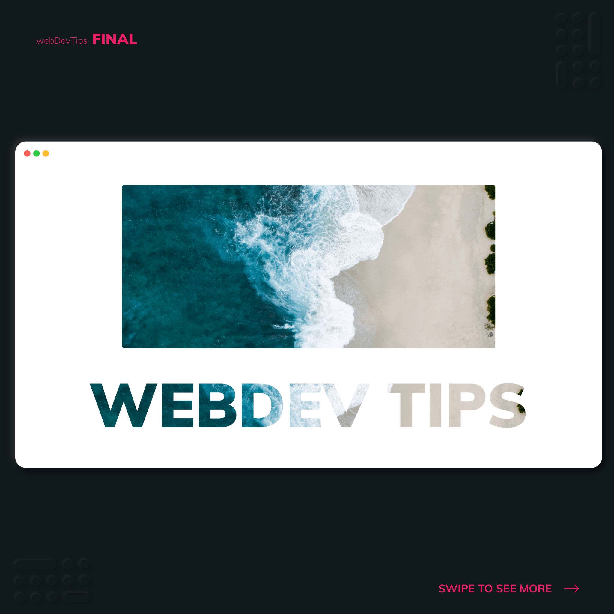
What's up guys? Today we'll check a very simple tip on how to create knockout text - that effect where the text is masking an image.
Doing this is really simple! We just need some text - I'm using an 'h2' tag for it - and then we need to apply some CSS properties to it.
<div class="background"></div>
<h2>WebDev Tips</h2>
The first property we need to apply on our text is 'background' where we'll set the image we want to use, it's size and position. Then we need to apply '-webkit-text-fill-color: transparent' and '-webkit-background-clip: text'. Finally, we should also apply a fallback 'color' for browsers that might not support this.
.background {
  width: 85%;
  height: 300px;
  margin: 2rem auto;
  background: url(./bg.jpg);
  background-size: cover;
  background-position: 50%;
  border-radius: 4px;
}

h2 {
  font-size: 7rem;
  background: url(./bg.jpg);
  background-size: cover;
  background-position: 50%;
  -webkit-text-fill-color: transparent;
  text-transform: uppercase;
  -webkit-background-clip: text;
  font-weight: 900;
  color: black; /* Fallback color here */
}
And that's all! What do you think of using this knockout text effect on a website? 😊✌