Creating a neat date input with react-datepicker
Hey there 😁✋
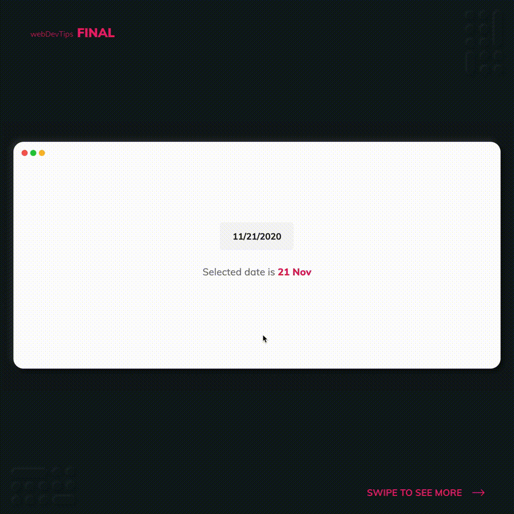
For today's tip I thought of sharing with you this neat React Component that I use a lot on my apps: react-datepicker.
react-datepicker give you a ready to use Datepicker Component super handy for cases where you need the user to input a date. Let's check how to use it!
import React, { useState } from 'react'
import DatePicker from 'react-datepicker'
import { format } from 'date-fns'
import 'react-datepicker/dist/react-datepicker.css'

const App = () => {
  const [date, setDate] = useState(new Date())
  console.log(date)
  return (
    <div className="datepicker">
      <DatePicker selected={date} onChange={date => setDate(date)} />
      <p>
        Selected date is <span>{format(date, 'd MMM')}</span>
      </p>
    </div>
  )
}

export default App
We'll start by installing this with 'npm install react-datepicker' and importing it on our App component. Using the 'useState' hook we'll store a 'date' and a function 'setDate' to update it.
Now we can go ahead and use the DatePicker component and pass it our 'date' on the 'selected' prop and the 'setDate' on the 'onChange' prop. And we've successfully implemented this date picker input.
Using the 'date' var we can now have access to whatever date the user picks. In this example I'm displaying this date below the DatePicker and I'm using 'date-fns' to format this date. I'm gonna have a specific tip on 'date-fns' so more on that later.
.datepicker {
  display: flex;
  align-items: center;
  justify-content: center;
  flex-direction: column;
}

.react-datepicker-wrapper input {
  background: #f5f5f5;
  color: #212121;
  border: none;
  padding: 1rem;
  border-radius: 4px;
  font-weight: 600;
  font-size: 1.1rem;
  width: 9rem;
  text-align: center;
  cursor: pointer;
}

p {
  margin-top: 2rem;
  font-size: 1.2rem;
  color: #757575;
}

p span {
  color: #e91e63;
  font-weight: 800;
}
And that's pretty much it. Let me know your thoughts on the comments 🤗✌️