Animating the z-index property in CSS
Animating the z-index property in CSS 📚
A couple of tips ago I referenced a post about properties that you can animate in CSS - post
One of the things I found really interesting in this post was animating the z-index property, as I had never thought of that. So I decided to do a very basic animation to show you that indeed z-index can be animated and you can do some original stuff with it!
<div class="scene"></div>
<div class="scene"></div>
<div class="scene"></div>
<div class="scene"></div>

<div class="main">Let's move this around</div>
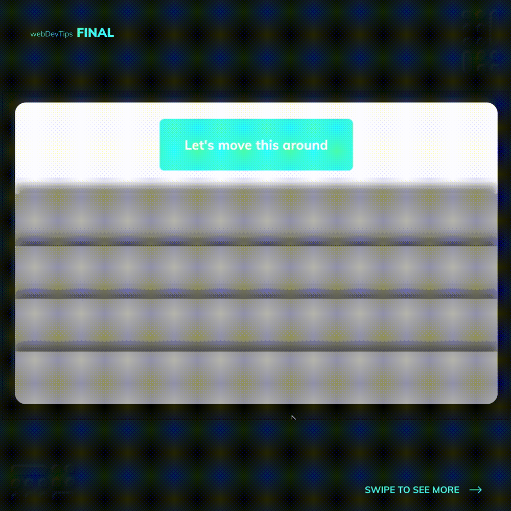
On this example I just have a set of fixed divs stacked one after the other, with different z-index values. Then, we have our main element that will be animated to go from top to bottom while changing the z-index value so it can go to the top of each div it passes through.
.scene {
  position: absolute;
  width: 100%;
  height: 6rem;
  background: #a5a5a5;
  box-shadow: 0 -16px 15px rgb(0 0 0 / 40%);
}

.scene:nth-child(1) {
  bottom: 0;
  z-index: 4;
}
.scene:nth-child(2) {
  bottom: 6rem;
  z-index: 3;
}
.scene:nth-child(3) {
  bottom: 12rem;
  z-index: 2;
}
.scene:nth-child(4) {
  bottom: 18rem;
  z-index: 1;
}

.main {
  position: absolute;
  left: 0;
  right: 0;
  margin: 0 auto;
  background-color: #45fce4;
  width: 22rem;
  padding: 2rem;
  text-align: center;
  font-weight: 700;
  font-size: 1.5rem;
  color: #fff;
  border-radius: 8px;

  animation: moveAround 5s linear forwards;
}

@keyframes moveAround {
  0% {
    bottom: 80%;
  }

  40% {
    z-index: 1;
  }

  45% {
    z-index: 2;
  }

  85% {
    z-index: 3;
  }

  100% {
    bottom: 0;
    z-index: 4;
  }
}
And that's it! How about you? Did you know that z-index could be animated? 🤔🤔