Using CSS Animations to create a background with a moving gradient
CSS animations are awesome to give life to your layouts. Knowing how to do them (and when to use them, since we don't want to overuse them) is super important for any Web dev. With just some few lines of CSS you can create cool animations and, if done properly, improve the overall user experience.
<div class="parent flex-center">

   <div class="box flex-center moving-gradient">
       My background is animated!
   </div>

</div>
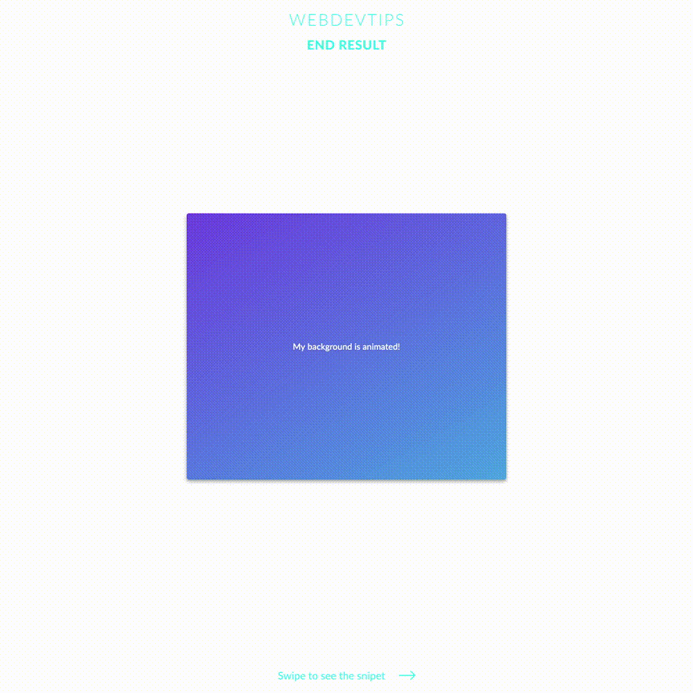
Creating a moving gradient animation is super simple and with some cool gradient can help you add a little spark to a section of your website. To understand how this animation works, just look at the 'moving-gradient' class and the 'moveGradient' Keyframes. We set a linear-gradient background on the element and set its size to '200% 200%'. This will make the background have double the size of our element thus giving us room to move it around and creating the animation.
Then, we set 'animation: moveGradient 10s ease infinite'. 'moveGradient' is the name we give to our animation (and Keyframes), '10s' is the duration of the animation, 'ease' is the animation mode and 'infinite' is the animation-iteration-count - this is basically the number of times you want to repeat the animation and in this case we want to keep looping and never stoping, so we use 'infinite'.
.flex-center{
   display:flex;
   align-items: center;
   justify-content: center;
}

.box{
   width:600px;
   height:500px;
   color:#fff;
   border-radius: 4px;
   box-shadow: 0 3px 6px rgba(0,0,0,0.16),
   0 3px 6px rgba(0,0,0,0.23);
}

.moving-gradient{
   background:linear-gradient(150deg, #8125E2, #45FCE4);
   background-size: 200% 200%;
   animation: moveGradient 10s ease infinite;
}

@keyframes moveGradient{
   0%{ background-position: 0 50%; }
   50%{ background-position: 100% 50%; }
   0%{ background-position: 0 50%; }
}
Finally, we just have to declare our Keyframes with the same name we gave to our animation. Here we'll define what we want to animate and when. We want to have the background-position at '0 50%' in the beginning of the animation, at '100% 50%' in the middle of the animation and at '0 50%' by the end of it. This will create a perfect loop with the gradient moving back and forth.
Super simple right? 🤓