How to smooth scroll between anchors using CSS only
Having anchors on your page that take you to a different section on the same page using smooth scroll is nothing new. This has been around for a while but we used to have to do this using jQuery or vanilla JS. Now, we can do this using CSS only and it's only one line!
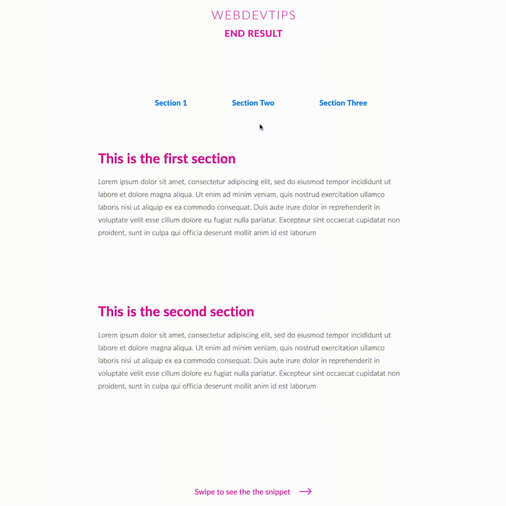
Look at the snippets to understand how this works: we need to have some sort of navigation where we'll have our anchors. The 'href' in these anchors must be equal to the 'id' of the element where we want to scroll to. With this done we'll already be able to navigate between the different elements but without any scroll effect, only a sudden 'jump'.
<div class="container">

   <div class="nav" id="nav">
       <ul>
           <li><a href="#one">Section 1</a></li>
           <li><a href="#two">Section Two</a></li>
           <li><a href="#three">Section Three</a></li>
       </ul>
   </div>

   <div class="content" id="one">
       <h1>This is the first section</h1>
       <p>
           Lorem ipsum dolor ...
       </p>
   </div>

   <div class="content" id="two">
       <h1>This is the second section</h1>
       <p>
           Lorem ipsum dolor ...
       </p>
   </div>

   <div class="content" id="three">
       <h1>This is the third section</h1>
       <p>
           Lorem ipsum dolor ...
       </p>
   </div>

   <div class="back-to-top"><a href="#nav">Back to Top</a></div>

</div>
In our 'grid-container' class we'll have 'display: grid' to initialize the grid. Then, since we want to have three equal sized colums we use 'grid-template-columns: 1fr 1fr 1fr'. 'Fr' symbolizes a fractional unit and '1fr' means 1 part of the available space. So, with '1fr 1fr 1fr' we'll have three grid-items, each one with 1/3 of the available space minus the grid-gap. Obviously, if you want 5 equally sized columns you woud set this property to: '1fr 1fr 1fr 1fr 1fr'. Another way of doing the same thing without using 'fr' is to use 'grid-template-columns: 20% 20% 20% 20% 20%', thus creating 5 columns, each with 20% of the available space. Finally, we set 'grid-gap: 20px' to get a - wait for it - 20 pixels gap between each one of these columns. Pretty self explanatory, right?
.container{
   width:50%;
   margin:120px auto 1000px auto;
}

.nav{
   margin-bottom: 100px;
}

ul{
   display: flex;
   width: 500px;
   align-items: center;
   justify-content: space-between;
   margin: 0 auto;
   list-style: none;
   color:#007EFF;
   font-weight: 600;
   font-size: 18px;
}

.back-to-top{
   color:#007EFF;
   font-weight: 600;
   font-size: 18px;
}

.content{
   margin-bottom: 150px;
}

h1{
   color:#F40AA1;
}

p{
   color: #424242;
   font-size: 17px;
   font-weight: 300;
   line-height: 30px;
}

html{
   scroll-behavior: smooth;
}
Finally, to get the desired smooth scrolling effect we just need to apply 'scroll-behavior: smooth' to our 'html' element and it's all done! That easy!