How to use the pseudo-element 'after' to create a speech bubble
CSS pseudo-elements are a powerfull feature that let you style a specific part of a specific element. While there are different pseudo-elements such as '::before', '::first-line' and '::first-letter', here I'm showing how to use '::after'. This pseudo-element is almost the same as '::before', the only difference being the fact that when you use '::after' its content will be placed after the content from the selected element. With 'before' it's the opposite.
<div class="parent flex-center">

   <div class="box flex-center speech-bubble">
       I am a speech bubble using a pseudo element!
   </div>

</div>
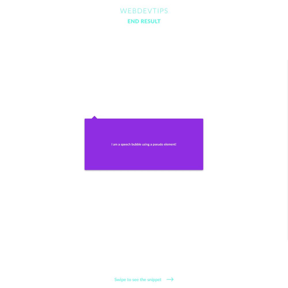
In this case we'll create a simple speech bubble with just some lines of code. We just need a 'div' (even though we can use pseudo-elements on any element) that will be the main element where we'll use the '::after'.
Just look at the 'speech-bubble' class since that's where all the important stuff happens. We begin by setting 'position: relative' on this element. This allows us then to place the pseudo-element exactly where we want to in relation to the ' div' - more on this on future tips.
.flex-center{
   display:flex;
   align-items: center;
   justify-content: center;
}

.box{
   width:600px;
   height:260px;
   color:#fff;
   border-radius: 4px;
   background-color:#8E2DE2;
   box-shadow: 0 3px 6px rgba(0,0,0,0.16),
   0 3px 6px rgba(0,0,0,0.23);
}

.speech-bubble{
   position: relative;
}

.speech-bubble::after{
   content: '';
   position: absolute;
   top: -10px;
   left: 40px;
   height: 20px;
   width: 20px;
   background: inherit;
   transform: rotate(45deg);
   border-radius: 2px;
}
Then, we start applying the CSS to the pseudo-element by using our 'div' class followed by '::after' - '.speech-bubble::after'. The first thing we need is the property 'content'. Without this, our pseudo-element won't even show up. Here we can place a string or a image, for example, but in this case since we don't want nothing inside it we just set it to ' '. Next, we use 'position: absolute', 'top: -10px' and 'left: 40px' to place it exactly where you see in the image. We obviously need to set a 'height' and 'width', since otherwise nothing would appear. I'm setting this properties both to '20px' so the result is a square. I'll then just set the background to 'inherit' to have the same background color as our main element, rotate the pseudo-element '45deg' to create a fake triangle and finally just add a little bit of 'border-radius' to soften up a bit our '::after'.
That's it! It's quite easy to use this and with it you can create endless stuff ✊