Creating a loading spinner animation using CSS only
What's up guys? So today I want to share with you a really simple way to create a loading spinner animation that you can use on your projects!
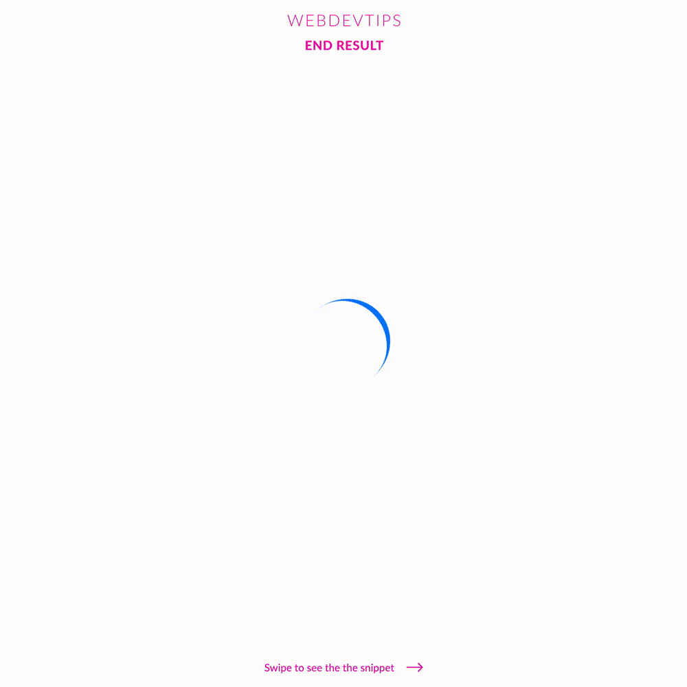
Obviously, all loading animations need some kind of logic for you to know if something is loading but here we'll just focus on the visuals of it.
<div class="loading-spinner"></div>
Okay, so we basically just to create a 'div' element. Then, in CSS, we turn this 'div' into a circle by giving it the same 'width' and 'height' and 'border-radius:50%'. We won't set any background color, we'll just give it a border on one of the sides ( in this case it's in the right ). Finally, we create a linear, infinite animation with a duration of 800ms that will just fully rotate our element. Obviously you can change duration from '.8s' to whatever value you prefer and you can also change the size and color of the border to change the look of the spinner.
.loading-spinner{
   width:130px;
   height:130px;
   border-right:8px solid #007EFF;
   border-radius:50%;
   animation: spin .8s linear infinite;
}

@keyframes spin {
   100%{
       transform:rotate(360deg);
   }
}
Aaaand, that's all! Hope you guys liked this tip 🤘🔥