What exactly does the 'box-sizing' property do and why does it matter
Hey guys, how's your week going ? Today I want to talk to you about the CSS 'box-sizing' property. This property is often overlooked and people really don't understand what it does exactly. Basically what it does is defining how the total width and height of an element will be calculated. We can chose to include the padding and the border in these calculations or not.
<div class="container">

   <div class="box-wrapper">
       <div class="box box1"><h3>Content Box</h3></div>
   </div>

   <div class="box-wrapper">
       <div class="box box2"><h3>Border Box</h3></div>
   </div>

</div>
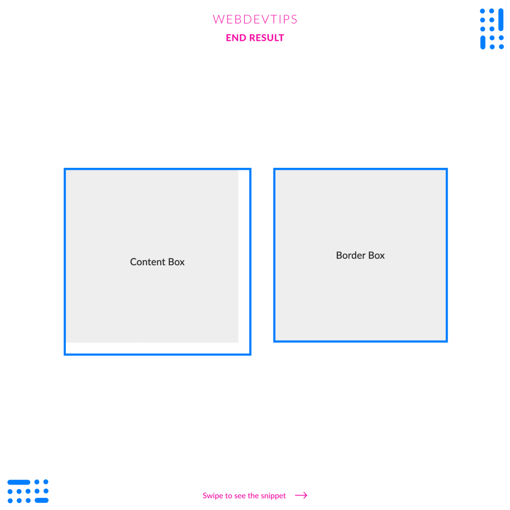
Look at the example we have here. We have a 'box-wrapper' div acting like a container that has a specific width and height. Then we have another div inside - 'box' - that will take the whole width and height of the parent and that has some padding and a border. With this we can easily see the difference in the 'box-sizing' property.
.container{
   width: 100%;
   height: 100vh;
   display:flex;
   align-items:center;
   justify-content: center;
}

.box-wrapper{
   width:400px;
   height:400px;
   background-color:#EEEEEE;
   margin:0 40px;
}

.box{
   width:100%;
   height:100%;
   border: 5px solid #007EFF;
   padding:10px;
   display: flex;
   align-items: center;
   justify-content: center;
}

.box1{
   box-sizing: content-box;
}

.box2{
   box-sizing: border-box;
}

h3{
   color:#212121;
   font-weight: 400;
   font-size: 1.4em;
}
The first box has 'box-sizing: content-box' so the padding and the border won't be taken into account. The result is that this div will became larger than it's parent because it has the same width and height PLUS the padding and the border.
The second box has 'box-sizing: border-box' so it will always take the padding and the border into account. The result is clearly visible, our div will always have the same dimensions as it's parent even with the padding and the border.