Creating highly responsive images using the HTML 'picture' element
Today we'll see a cool and really simple method to create responsive images for your websites. Basically, this method works by you providing different size and ratio images, that will then be used based on some criteria. To do this we'll be using the HTML 'picture' element.
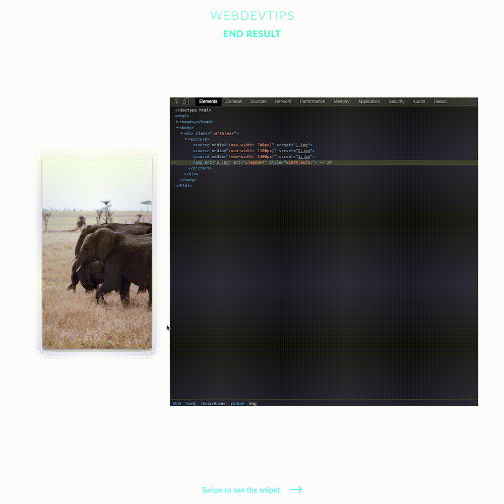
<picture>
   <source media="(max-width: 700px)" srcset="1.jpg">
   <source media="(max-width: 1100px)" srcset="2.jpg">
   <source media="(max-width: 1400px)" srcset="3.jpg">
   <img src="2.jpg" alt="Elephant" style="width:auto;">
</picture>
The 'picture' tag works by using it to wrap different 'source' elements. Each of these elements will be an image and will have a 'media' attribute where we'll set the criteria to show the image. In this case I'm using the max-width of the viewport to set the correct image, but other rules can be used - Looking at the HTML code example, we can see three 'source' elements being wrapped by the 'picture'. Each 'source' has a 'media' and a 'srcset' attribute. On the first one we'll put the rule talked about above. In this case we'll only show the first image, for example, if the viewport has a max-width of 700 pixels. On the second attribute we need to put the path to the image we want.
picture{
   text-align: center;
}

picture img{
   width:75% !important;
   border-radius: 4px;
   box-shadow: 0 10px 20px rgba(0,0,0,0.19),
               0 6px 6px rgba(0,0,0,0.23);
}
Finally, we just need to add a fallback image in case the browser doesn't support this. To do this, just use a regular 'img' element after all your 'source' elements as you can see in the code example. And that is all!