Creating a card flip hover animation with some CSS
How was your weekend guys? Ready to start the week with some CSS?
Today I want to show you how can easily create a card flip animation on hover with some pretty basic CSS.
To start we need to implement the following HTML: a 'card-container' div, inside it a 'card' div, and inside this one we'll have two div's with the classes 'front' and 'back'. Each one of these last div's will serve as the front and back for the card when we flip it. Now, onto the CSS.
<div class="card-container">
<div class="card">
<div class="front">
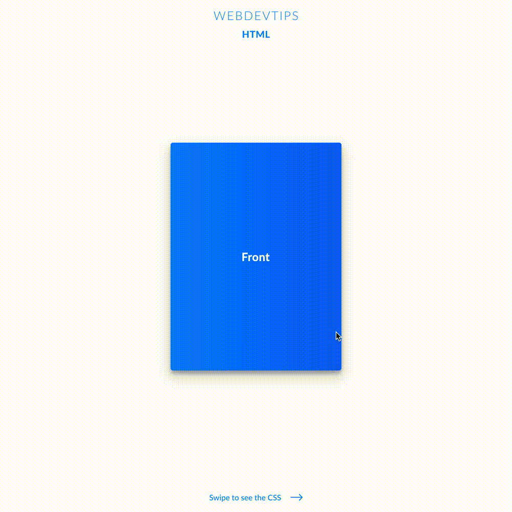
<p>Front</p>
</div>
<div class="back">
<p>Back</p>
</div>
</div>
</div>
We need to specify a 'width' and 'height' for our 'card-container'. This will be the final size that our card will have. I chose '300' and '400' pixels respectively. On this same element we'll also need to apply 'perspective: 900px'. This will help us create a more realistic effect on the flip animation.
.card-container {
   width: 300px;
   height: 400px;
   border-radius: 4px;
   perspective: 900px;
   background-color: transparent;
}

.card {
   position: relative;
   width: 100%;
   height: 100%;
   transition: all .7s;
   transform-style: preserve-3d;
}

.card-container:hover .card{
   transform: rotateY(-180deg);
}

.front {
   background: linear-gradient(90deg, #0086FF, #0066FF);
}

.back {
   background: linear-gradient(90deg, #FF2A78, #F100AE);
   transform: rotateY(-180deg);
}

.front, .back {
   position: absolute;
   width: 100%;
   height: 100%;
   display: flex;
   align-items: center;
   justify-content: center;
   color: white;
   border-radius: 4px;
   box-shadow: 0 10px 20px rgba(0,0,0,0.19), 0 6px 6px rgba(0,0,0,0.23);
   backface-visibility: hidden;
}
Next, our 'card' the element will need to have relative position, 100% width and height, a transition for when we do the animation and finally 'transform-style: preserve-3d'. This last property will also help us create a better and more realistic effect. We'll also need to set an 'hover' rule on our 'card-container' that will affect our 'card'. This rule will simply transform the 'card' div and rotate the Y axis by '-180deg'.
Now, we need some specific rules on the 'front' and 'back' div's. First, and only on the 'back' div we apply 'transform: rotateY(-180deg)'. Then, on both elements, we need to apply absolute positioning, 100% width and height and 'backface-visibility: hidden' which will prevent us from seeing the wrong element. Finally, all the other CSS rules concern the styling of the cards and not the flipping animation itself.