Animated custom toggle button with CSS
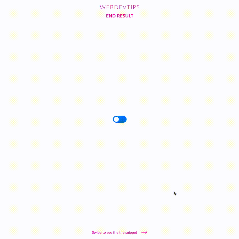
Toggle buttons have been quite trendy for a while now. Whether it's for boolean fields on a form, or simply to toggle between a light and dark theme on your app, you can't go wrong with them. It's also a really cool way to spice up the old boring checkbox input, thus improving the user experience on mobile.
In order to this, we have to create a label surrounding a checkbox input and a span that we'll use for the circle and the slider. We basically just hide the input, use the span to create our slider bar and set an ':: before' on the span to create the circle.
<div class="parent flex-center">

   <div class="toggle-switch-container">
       <label class="toggle-switch">
           <input type="checkbox">
           <span class="slider"></span>
       </label>
   </div>

</div>
Then, we have to set two properties to be triggered when the input is checked - the background color on the slider bar and the translateY on the span::before to move the circle to the right. This will create a simple smooth animation to enhance the visuals.
.flex-center{
   display:flex;
   align-items: center;
   justify-content: center;
}

.toggle-switch {
   position: relative;
   display: inline-block;
   width: 60px;
   height: 30px;
}

.toggle-switch input {
   opacity: 0;
   width: 0;
   height: 0;
}

.slider {
   position: absolute;
   cursor: pointer;
   top: 0; bottom: 0; right: 0; left: 0;
   background-color: #007EFF;
   border-radius: 34px;
   -webkit-transition: .4s;
   transition: .4s;
}

.slider:before {
   position: absolute;
   content: "";
   height: 22px;
   width: 22px;
   left: 4px;
   bottom: 4px;
   background-color: white;
   border-radius: 50%;
   -webkit-transition: .4s;
   transition: .4s;
}

input:checked + .slider {
   background-color: #F40AA1;
}

input:checked + .slider:before {
   transform: translateX(30px);
}
That's it, a clean and simple toggle to add that touch of flair to your projects 🔥