Creating the Star Wars intro text effect only with CSS
Any Star Wars fans? Today we'll be looking at how we can easily create the classic intro text effect displayed on the start of every Star Wars movie, only with some CSS.
<div class="fade"></div>
<section>
<div class="text-container">
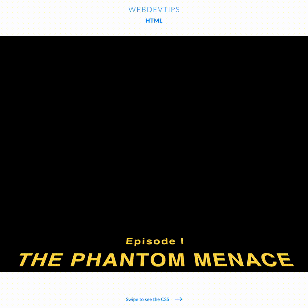
<div class="intro">
<h5>Episode I</h5>
<h1>The Phantom Menace</h1>
</div>
<div class="text">
<p>
Turmoil has engulfed the Galactic Republic. The taxation of trade
routes to outlying star systems is in dispute.
</p>
<p>
Hoping to resolve the matter with a blockade of deadly battleships,
the greedy Trade Federation has stopped all shipping to the small planet of Naboo.
</p>
<p>
While the Congress of the Republic endlessly debates this alarming chain of events,
the Supreme Chancellor has secretly dispatched two Jedi Knights, the guardians of peace
and justice in the galaxy, to settle the conflict....
</p>
</div>
</div>
</section>
For our markup, we'll first need a div with the class 'fade' that we'll use to create a semi transparent area were the text will start to fade. Then, we have a 'section' and inside it a 'div' with a class 'text-container'. Now, inside this div, we have a div where we'll have our intro text and then another div where we'll have the main text.
Now, for the CSS, we first style that 'fade' div. We'll give it an absolute position, place it at '-25px' from the top, and on the background we'll apply a linear gradient to create some sort of transparency. Next, we style our 'section'. We need to apply flex display, relative positioning and a perspective of '400px'. We can also give the styles for the text in here.
body {
   width: 100%;
   height: 100%;
   background: #000;
   overflow: hidden;
}

.fade {
   position: relative;
   width: 100%;
   min-height: 60vh;
   top: -25px;
   background-image: linear-gradient(0deg, transparent, black 75%);
   z-index: 1;
}

section {
   display: flex;
   justify-content: center;
   position: relative;
   height: 100vh;
   color: #feda4a;
   font-family: 'Pathway Gothic One', sans-serif;
   font-size: 500%;
   font-weight: 600;
   letter-spacing: 6px;
   line-height: 150%;
   perspective: 400px;
   text-align: justify;
}

.text-container {
   position: relative;
   transform-origin: 50% 100%;
   animation: starWars 50s linear;
}

.intro {
   font-size: 90%;
   text-align: center;
}

.intro h1 {
   margin: 0 0 120px 0;
   text-transform: uppercase;
}

@keyframes starWars {
   0% {
       top: 0;
       transform: rotateX(20deg)  translateZ(0);
   }
   100% {
       top: -7000px;
       transform: rotateX(25deg) translateZ(-2500px);
   }
}
We now have to style our 'text-container' with relative positioning, a transform-origin of '50% 50%' and apply an animation. This animation will be called 'starWars', with a duration of 50 seconds and a linear mode.
To wrap things up, we just have to create the keyframes for the 'starWars' animation. On the start of the animation, our element will have 'top: 0' and 'transform: rotateX(20deg) translateZ(0)'. On the end, our element will have 'top: -7000px' and 'transform: rotateX(25deg) translateZ(-2500px)'.